Case Study: Damai App
Overview
Damai is a new way to monitor qadha prayer especially for Muslim users. With Damai, users can see prayer times, manage their prayer and fasting qadha, view weather information, and look onto their prayer insight. This project is actually initiated by one of my best friend, **Amir Farhan.** He is Android Developer and also the one who will develop this app entirely.
The Problem
As a Muslim, there’s a time we may miss our prayers due to some reasons, and its our job to ‘qadha’ what we have missed.
‘Qadha’, is refers as to fulfilling or completing those duties that one may have missed due to some reason or other.
The Goal
Developing an app for muslim people to keep monitor and manage their qadha duties not only for prayers, but also for fasting.
Tools
- Figma
- Notion
- Macbook Pro 2015
Process
My process will be different for each projects depending on many factors such as the project goals, business needs, complexity of the problem, time and etc. Here I’ll describe my process for designing this app.

1. Discovery
Understanding the core of the product
Before doing any ideation I started to gather the requirements and list out all possible core features of the product.
Core product features
- Prayer Time by user location
- Managing daily prayer
- View, add, and edit qadha list
- Weather information
- Push notification when prayer time, and to remind the user to qadha their prayer
Analyzing similar app
Analyzing the existing similar app design and puts together in moodboard for future reference. I’ve also downloads some of the apps to know what are the pain points and strength of the apps.

Features Prioritization
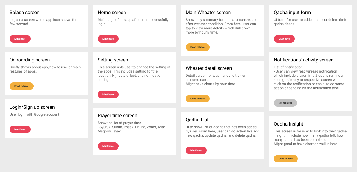
Prioritization of the features ensure that we can focus to deliver the most important features first. From the features, I have list out all possible screens that i have to design and categorized them to Must have, Good to have, and Not required
2. Ideation
Sketching and Wireframes
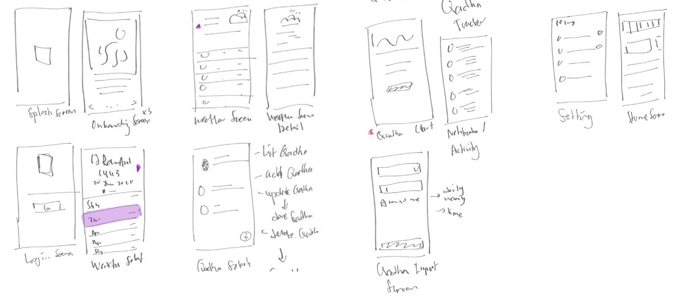
We had a list of screens to cover all features so I started to sketching the designs to detail out the flows to discuss and share with developer to get feedback.
I know its not the best sketches ever, but with this I can see the rough idea of the app already.
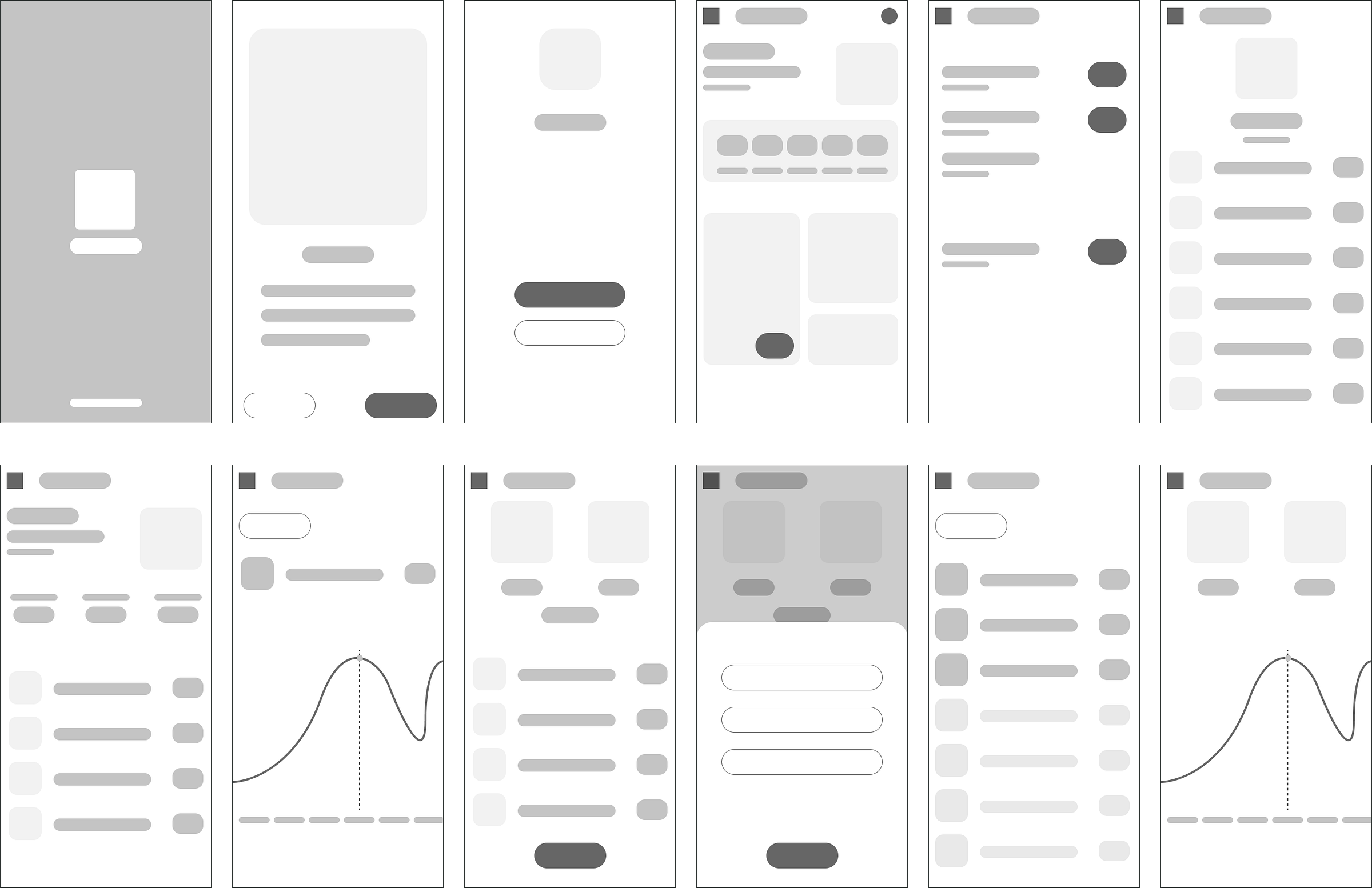
After discuss with developer, I get started with the wireframes. I created this set of low-fidelity wireframes of all of the key screens needed
Design Review
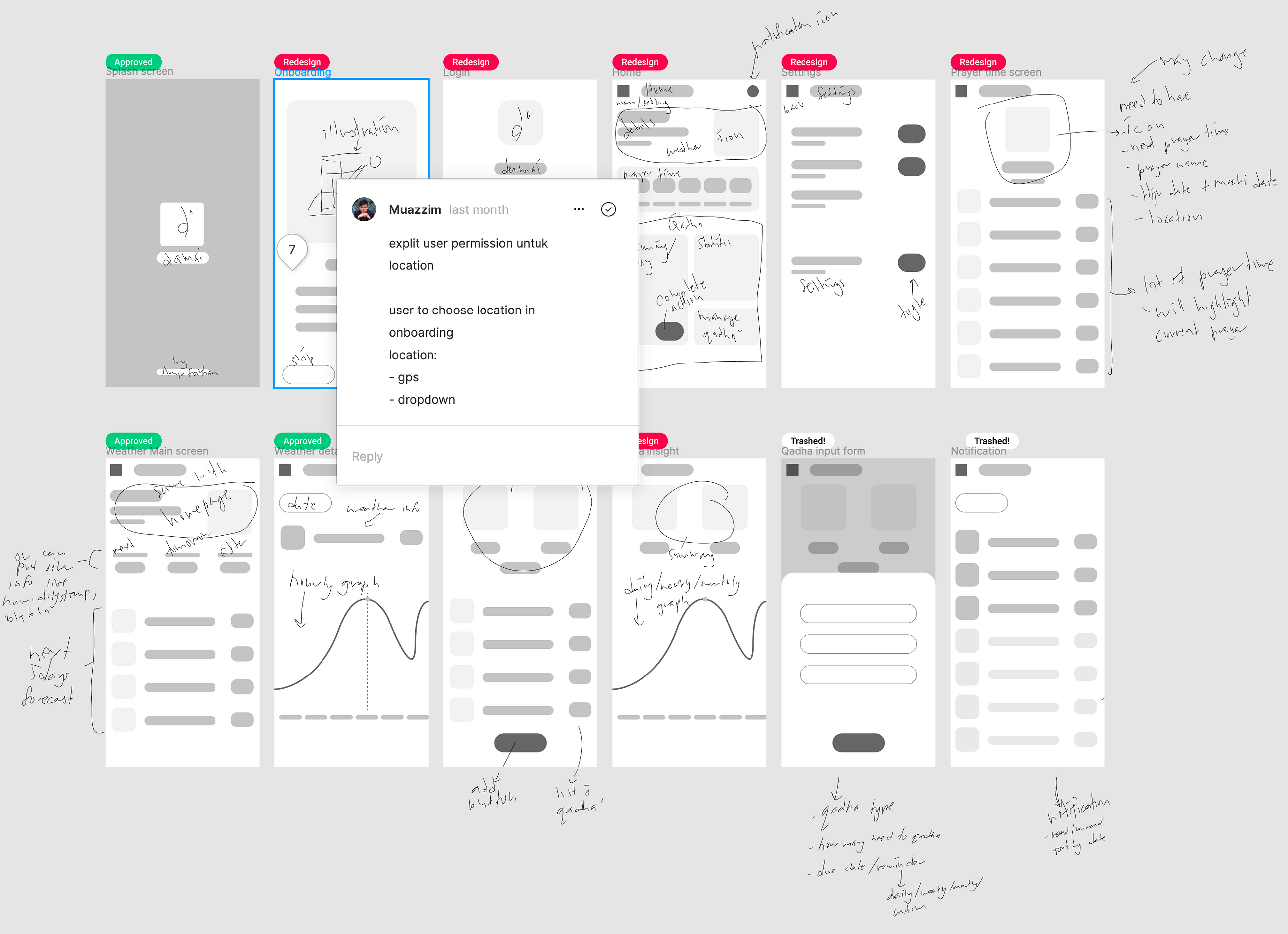
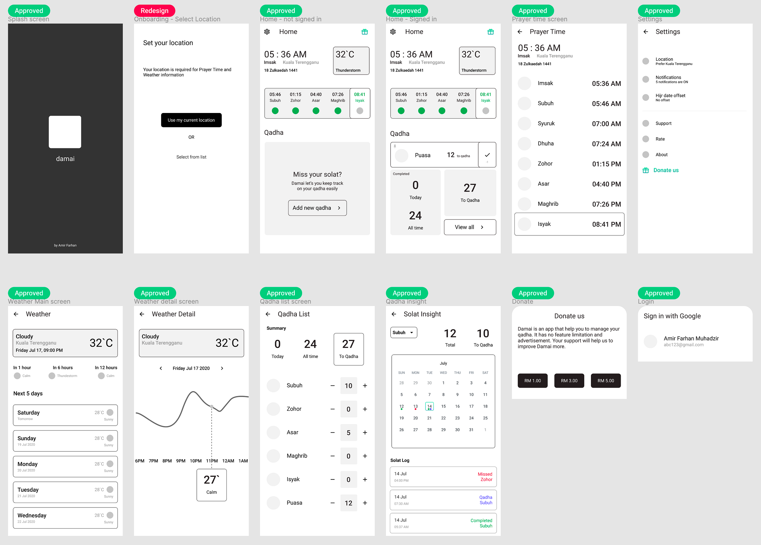
We do design review often during this ideation phase as I’m the type who want to get the feedback fast. With built-in comment feature combined with the pencil tool, doing the design review directly in Figma is a lot easier. I categories each screens whether it is APPROVED , need to REDESIGN , or have to TRASH the screens before moving to mid-fidelity wireframes.
Mid-Fidelity Wireframes
By now I have already gathered enough information to get started with the mid-fidelity wireframes. Creating mid-fidelity wireframes will also have a few design reviews and iterations as well. This is the final mid-fidelity wireframes that i have created.
3. Visual Design
After working the changes into the wireframes, it was time to proceed with the visual design. At first, I create a light theme design but after discuss with developer, we have agreed to use dark theme for Damai app.
Design System
Damai is not a big project, and not much ui screens too. So, the design system that i created is only covers the style guide, components, and icons. The design system act as single source of truth and it is important especially for a non-designer to easily look on to the design components and assets. By establishing the design system, the developer hand-off process would be much easier as well.
Style Guide
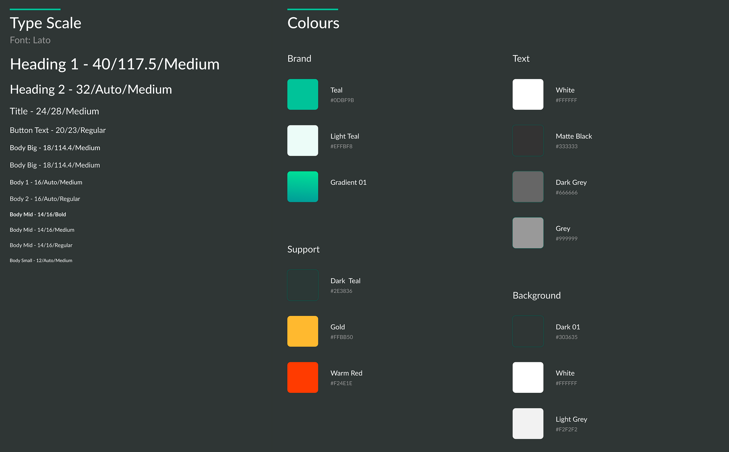
This is a style guide for Damai mobile application. This style guide only contains colors and typography.
Components
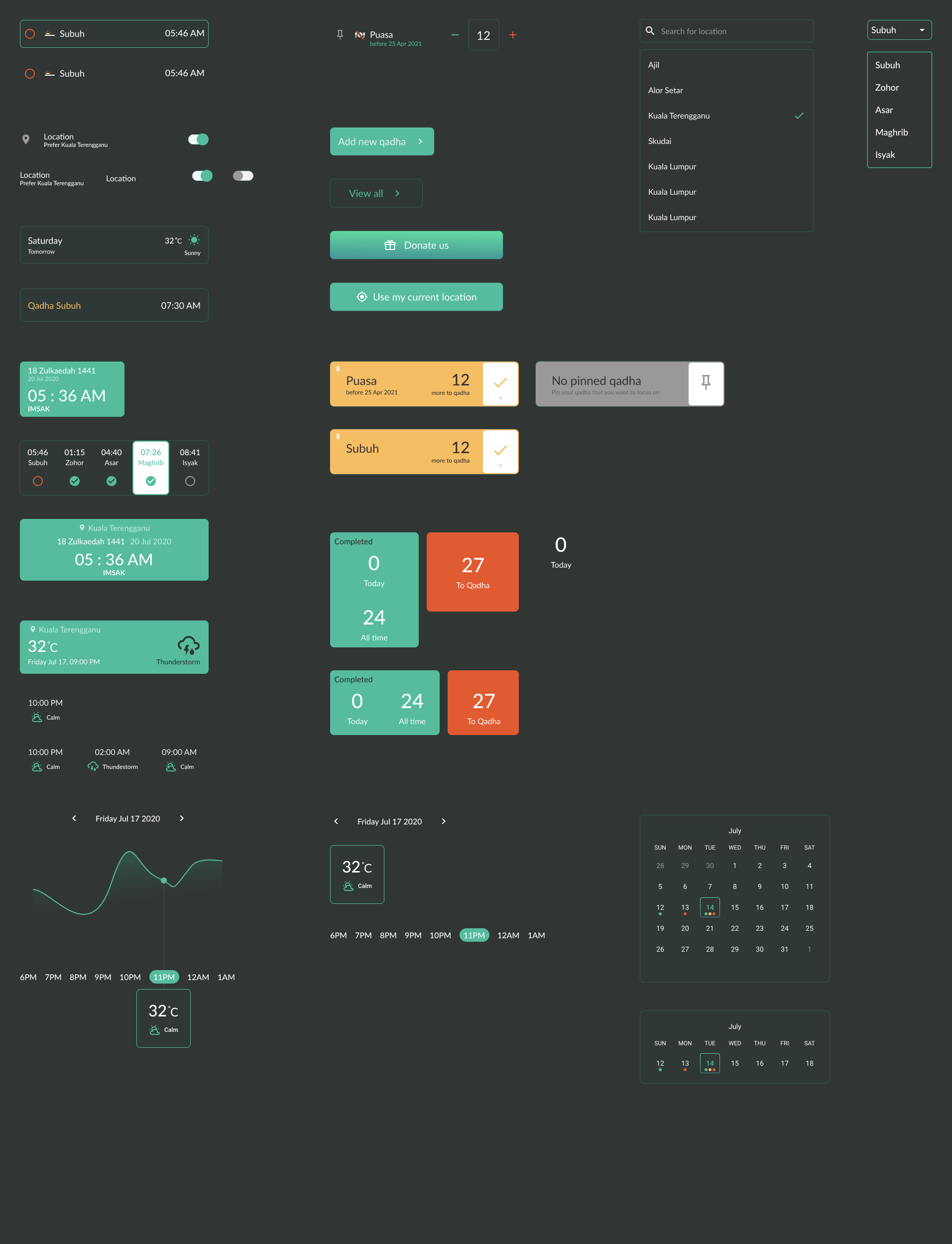
Components consist of UI elements such as cards, item list, form inputs, charts, and buttons with each of them has different states for different scenarios.
Icons
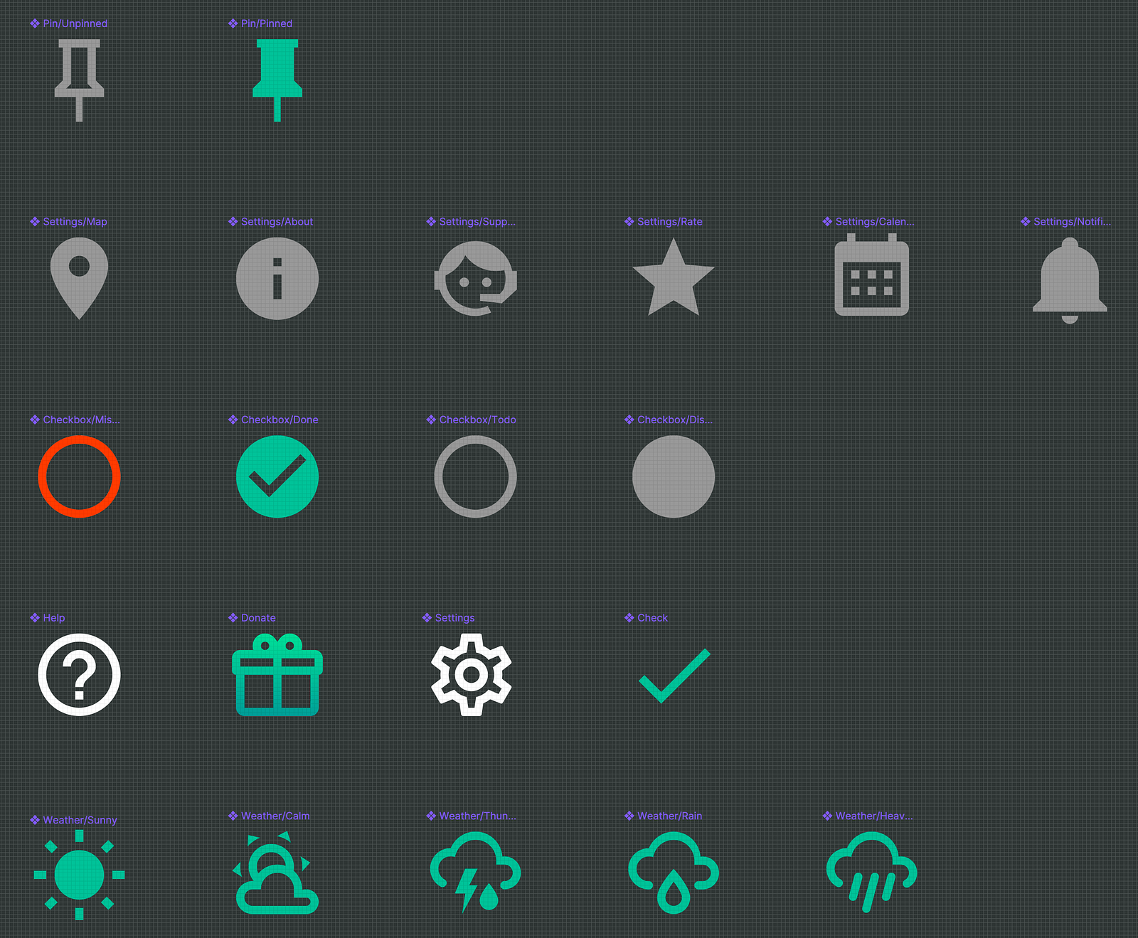
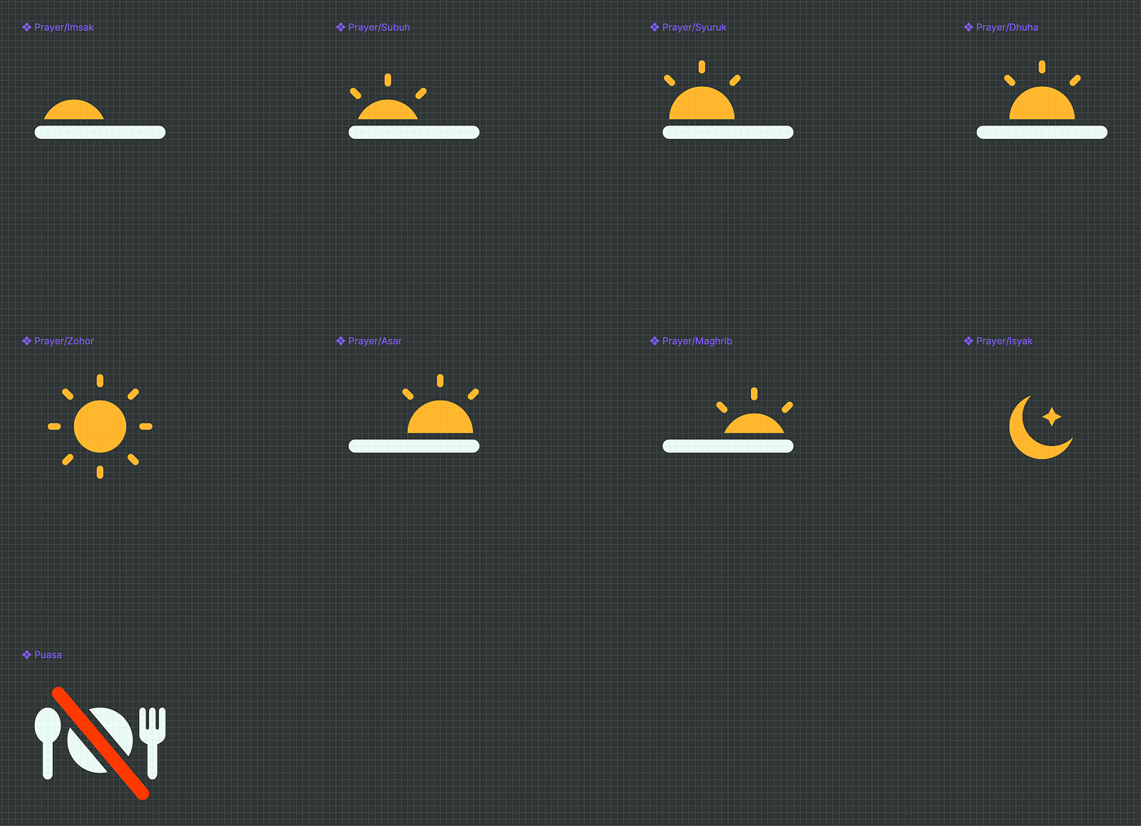
I’m mostly using Google’s Material Icons in Damai for basic usage. For a more specific usage, like showing different prayers, i created our own custom icons.
Damai Logo
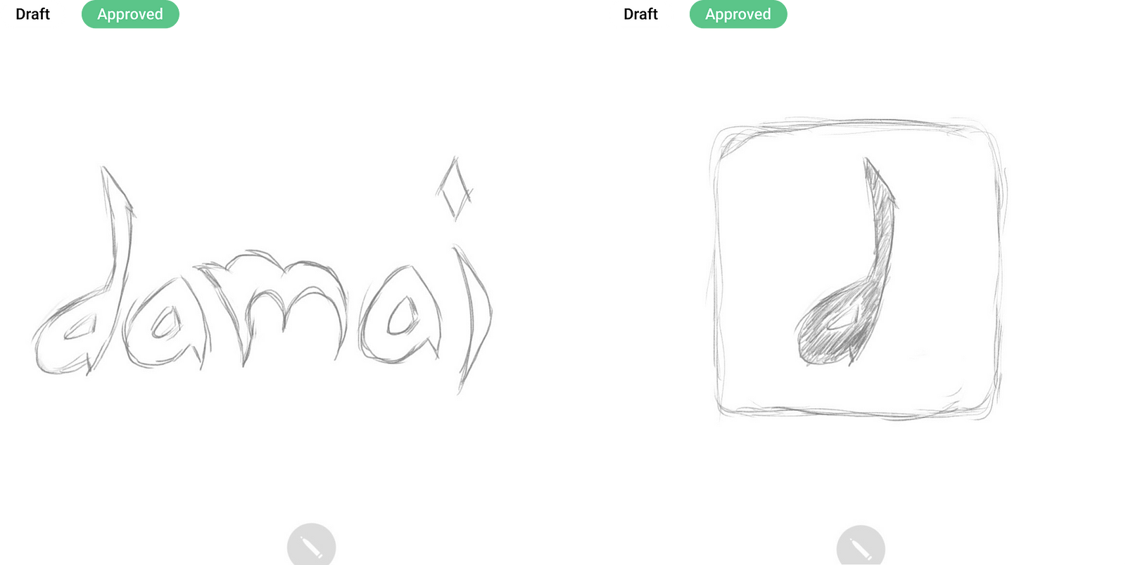
With inspiration from Arabic alphabets, I created Damai logo. The process is start with sketching, turn the sketch into vector, and finalize the logo design.

Final Logo
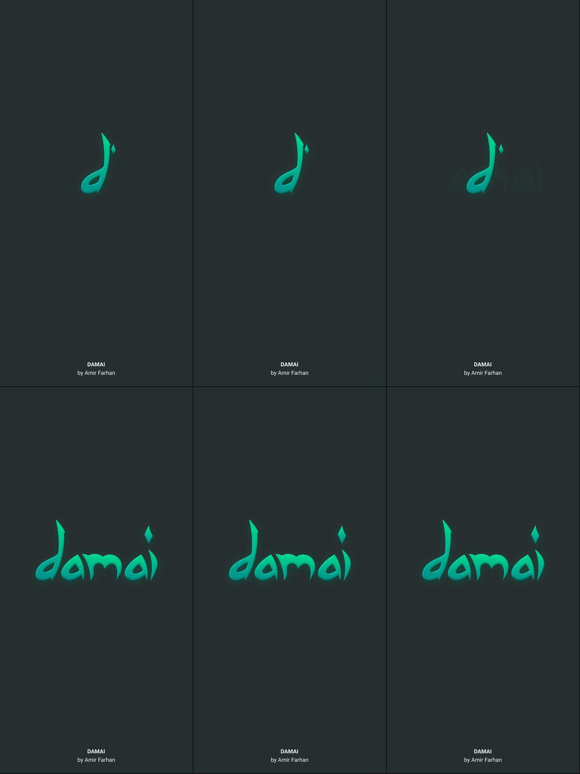
By adding some effects(combination of Inner Shadows and Drop Shadows), i make the logo to be more stands out

This is how the logo is animated in splash screen
Final Design
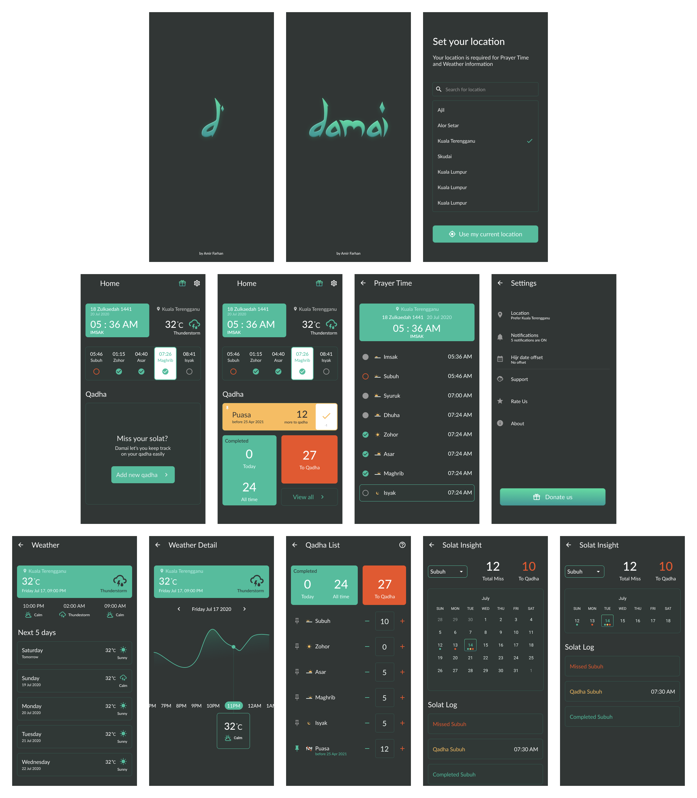
After a few more iterations, I designed the final screens with Figma. I conducted prototype validation during the process to determine the best user experiences of the app.
My aim was a clean, modern look that helps users fulfill their goals quickly. Also helps a new user especially a non-tech user to pickup the interface easily.
Developer Hand-off
The next step would be to hand-off the final prototype screens and other assets to developer. Figma has a very powerful developer hand-off tool built-in, so we don’t need to use third party tools like Zeplin to do the developer hand-off.
Inviting developer to Files and Prototype
In Figma, we can invite collaborators to a Prototype, or to the File itself. Inviting developer as a Viewer is enough because we don’t want them to mess up our design works 😝
Viewer can:
✅ Select layers from the Layers Panel or Canvas
✅ View properties of selected Layers in the Code panel
✅ Copy text content from Text objects
✅ Measure distances between object in the Canvas
✅ Add or reply to Comments in Files and Prototypes
✅ View Prototypes in Presentation View
✅ Access Components via the Go to Main Component link
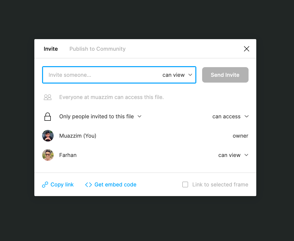
Keeping files organized
As developers get access to design files, which are filled with dozens of in-progress frames, iterations, components, and more, it’s good practice to communicate which parts of the files are ready for implementation and which are still being worked on.
Here’s my way of organizing pages in Figma
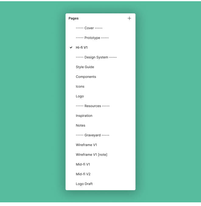
Code panel
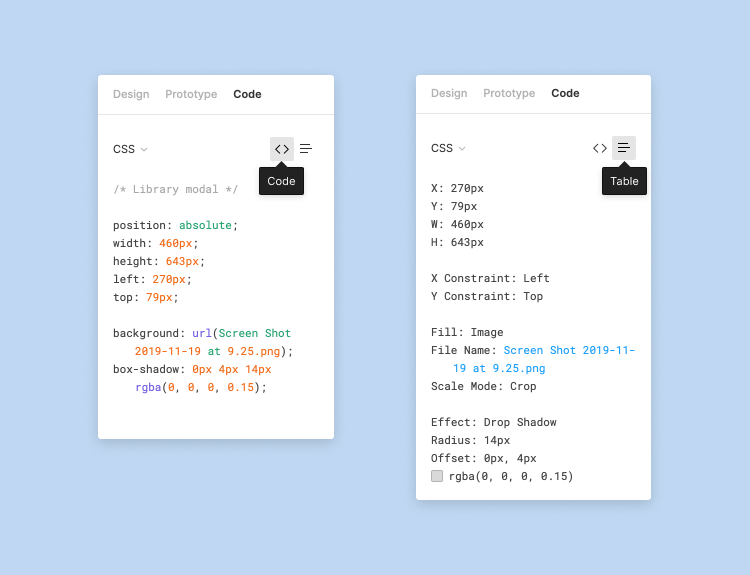
The Code panel allows Viewer to see how to express objects in code. This will help developer to see the selected objects properties in following formats:
1️⃣ CSS (CSS only, no HTML)
2️⃣ iOS (Swift)
3️⃣ Android (XML)
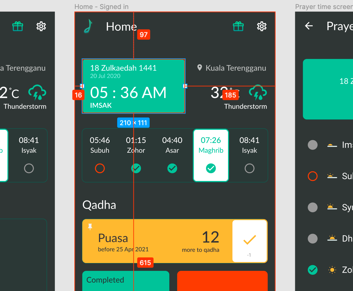
Whenever viewer is in Code panel, they can easily measure the distances between object in the Canvas. The red lines with the distances will be displayed when you hovered on it. This make developer easier to refer on the measurement of the components.
Wrapping Up
Creating a design for mobile app is fun and challenging project. Through ideation process, I was able to validate Damai’s core features and also discover what most people want to have in managing their qadha.
I’m happy with the end result which help me improved not only my UI design skills, but also my UX research skills.
Next steps
Although this project concluded with a solid prototype, I would still like to continue testing and improving the design. The app itself is still in the development, and I always there to support the developer with the testing.
Once Damai is launched, i hope everyone can support us!


