Case Study: Google Finance Redesign
Overview
Due to COVID-19 pandemic that strikes our world, I have forced to work from home. While working from home, i have more flexible time and of course more free time. Thus, i decide to do my own redesign project. Project that i decide to do is to redesign the Google Finance portal. In this article, I will tell how I completed this project.
Process
When it comes to redesign activity, we have a few processes involved. This is my process in redesigning UI (every designer have their own process).
Usually i start with Design Audit, then start creating low fidelity wireframe, follow up with high fidelity wireframe. Next, i’m creating a design system so that my design process will be much faster. And lastly, i will create an interactive prototype.
Let’s start with the processes.
1. Design Audit
In this process, I’m start with looking at current Google finance portal. During this activity, I will focus on reviewing not only the aesthetic, but also the experience and the easiness when using the portal. It is very important for me to know the entire portal to understand how the portal works. I take screenshot for each pages in different viewports (tablet and mobile).
With Figma, I can take auditing process to whole new level. I put all screenshots and arrange it according to the page and viewports as shown in the image below.
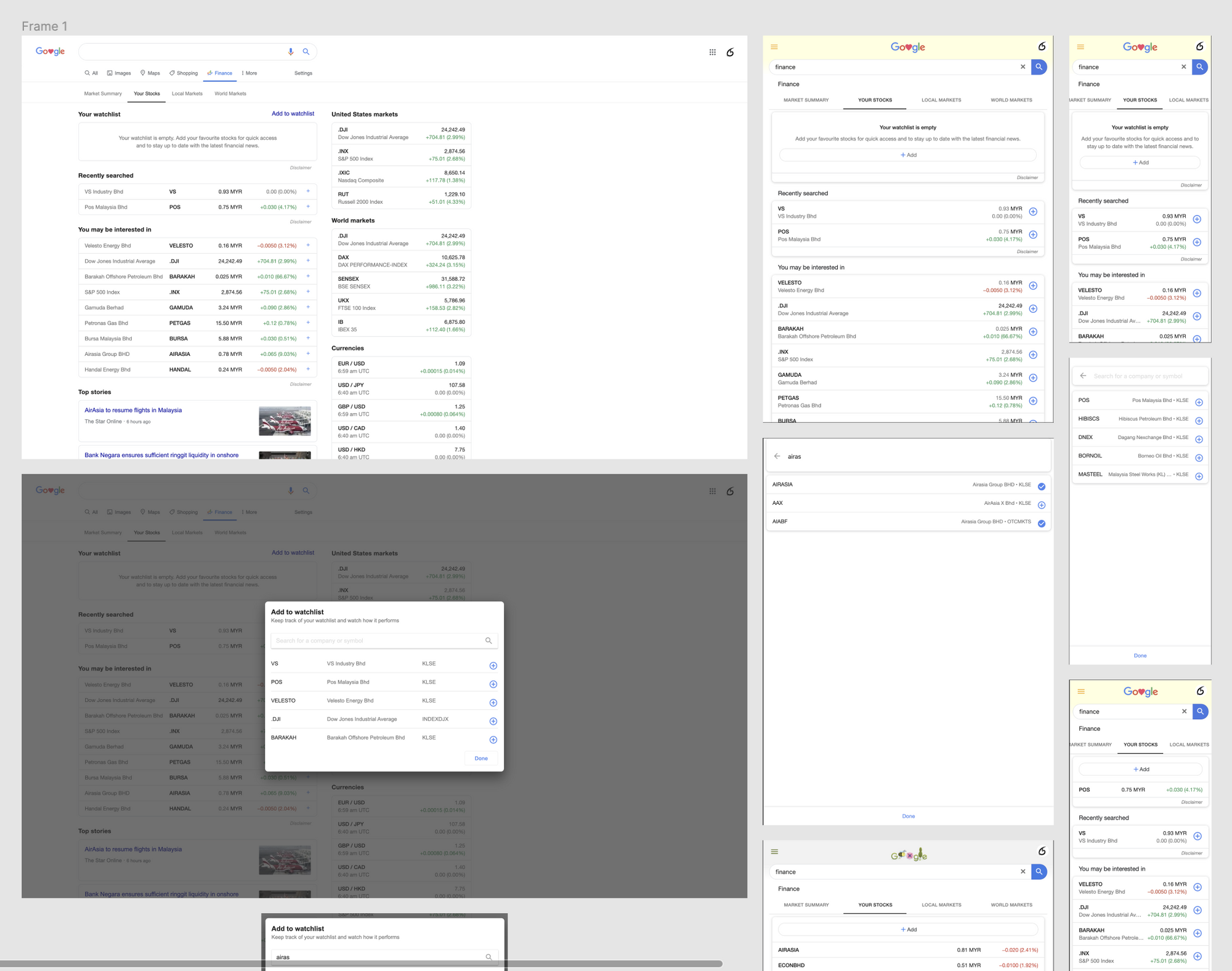
Once i done arrange all the screenshots, I will use Comment feature in Figma to define all possible UX problems in each page.
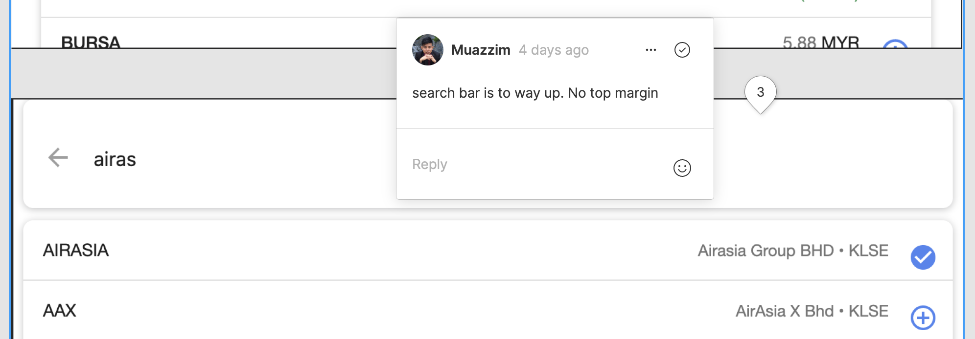
Here’s a few problems that i manage to identified
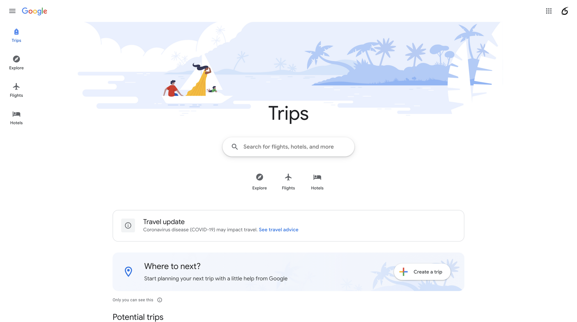
- The look and feels of the portal is just the same with normal google search. Compared to Google Trips portal, it has a nicer design and feel more like a single Google application.
- Inconsistency in ui design between desktop and tablet/mobile view. This will make user confuse with the interface when they access the portal from different device
- Navigation tabs in desktop view is not in ‘fixed’ position when the page is scrolled down
- In some cases, stocks displayed are repetitive. This can be seen when the user add the stocks that has been in the ‘You may b interested in’ section. The stocks will add into Watchlist, but it will still remain in that section as well. This cause the list to be longer, and no new recommendation for stocks.
2. Low/Med-Fi Wireframe
Based on the audit, I will start thinking of the solution to solve the problems that already been highlighted. Usually, i will look for design inspiration at site like Uplabs or Dribble.
Taking Google Trips as my inspiration, I start to draft my wireframe.
So what is wireframe? A wireframe is a simplified visual representation of a layout for an application’s interface. It can be represented as the architectural blueprints of the application itself.
Type of Wirefame:
- Low fidelity
- Medium fidelity
- High fidelity
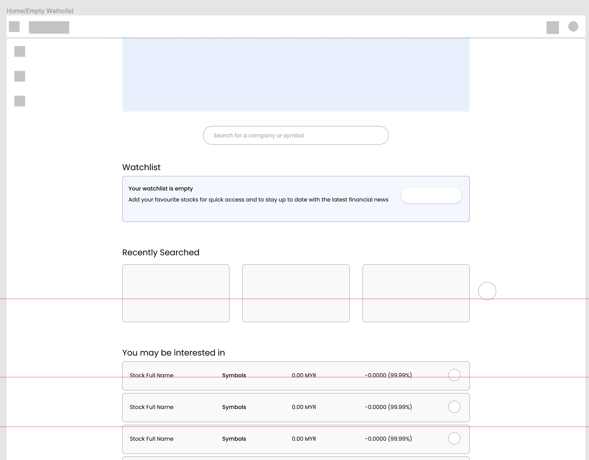
Low fidelity or low-fi wireframe is a just quick sketch of our ideas. It usually just a white and black sketches on the paper. But, for this activity, i will skip the paper sketch and jump directly to next level of wireframe that called medium fidelity wireframe. The reason is i already have a good reference for my idea which is Google Trips portal.
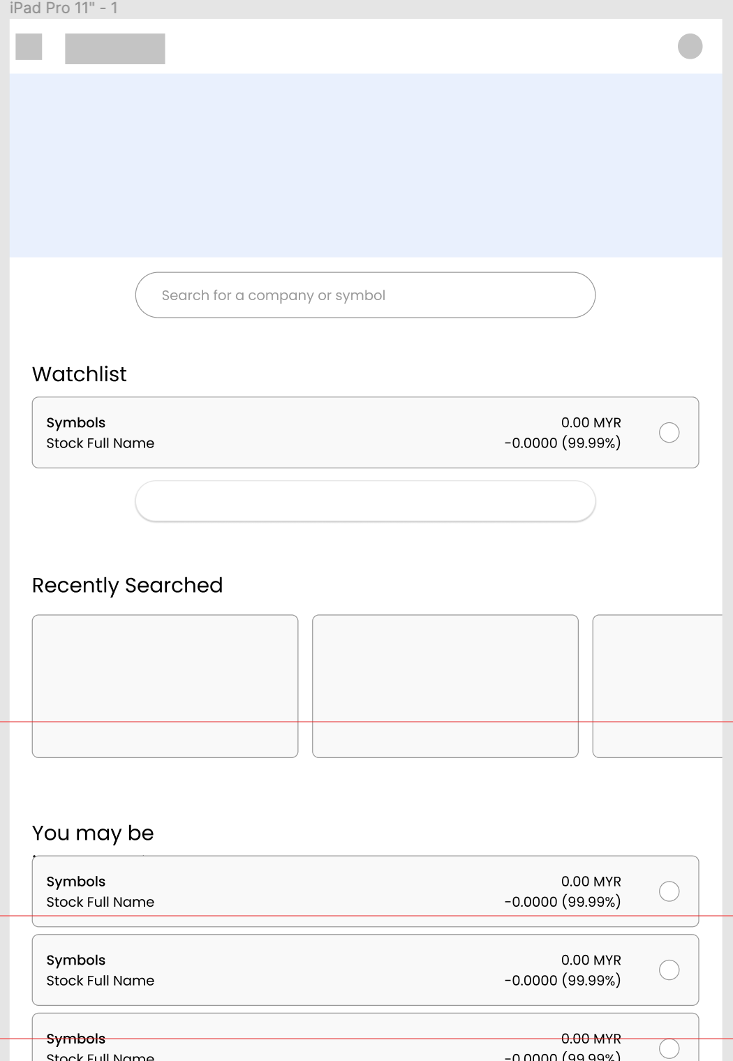
Medium fidelity wireframes is a more detailed and realistic UI components compared to low-fi wireframe, and usually it is created in monochrome or grayscale palette. I start by putting blocks that will show roughly the layout, size and position of each elements. On a single glance we can already see the entire layout of the screen itself.

3. Design System
Creating a design system or style guide is an optional process. You don’t need to have a design system to create a hi-fi wireframe. But it is good to have as it will make your design process much faster and save a lot of your time.
So what is design system? Design system is the single source of truth which groups all the elements that will allow the teams to design, and develop a product. It will consist not only the graphic styles (colors, fonts, illustrations, icons) but also all key elements and components which represent the brand of the product itself.
But for this project, I will not create a full design system. I will only create the design system specifically for ‘Your stocks’ tab. Also, I want to make sure my design has its ‘Google’ identity. So i decided to refer the Google official Material Design System as well.
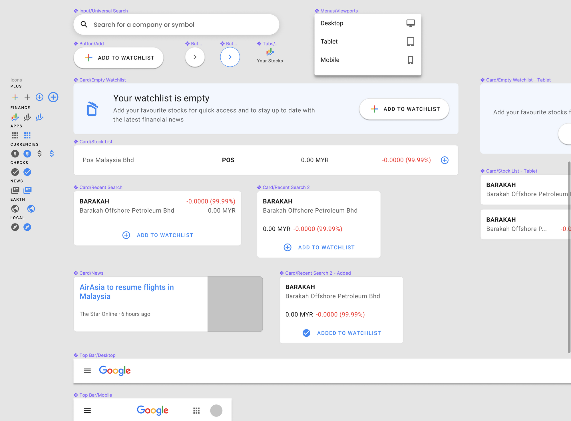
First I define what are the key elements that should have in the UI such as buttons, icons, texts, images, menus, and so on. Figma’s Component is just like Sketch’s Symbols(If you familiar with it). You can create reusable objects for your project. This components will act as guideline not only for designers, but also for developers during the design hand-off activity. Once we create the Component, we can duplicate it to create an instance and override its properties without affecting the Component’s properties. And if you change the properties in the Component, all instance will follow the new properties. With this, we don’t have to update manually the objects one by one.
Below is the snapshot of some components that I’ve created for this project. All of these components is created by me by referring to Material Design guideline.
There’s one last thing that is missing from the design system which is illustration. As I mention, i’m using Google Trips as inspiration. In Google Trips, we can see there’s a really nice and minimal illustration at the top. So, I want to create something similar to that but with my own creativity. My idea for the illustration is the view in the meeting room with stocks market charts display on the wall. So, i start ‘google’ a nice meeting room. Using that, i created my own illustration just for Google Finance.

4. Hi-Fi Wireframe
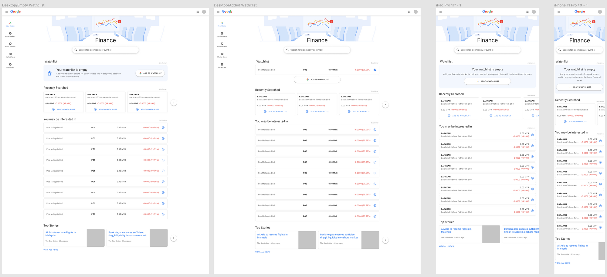
After done with the design system, it’s time to create a high fidelity or hi-fi wireframe. The differences between low-fi and hi-fi is that, hi-fi wireframe is focused more on its aesthetic. This is the process where we finally add colours, shape, icons, images, illustrations, and text contents.
This is the hi-fi wireframe
5. Prototyping
Lastly, it’s time for prototyping. In this process, i will use my hi-fi wireframe to create a prototype that user can interact and navigate. Prototype is very important not only for the user to test, but also all stakeholders including project manager, and developers.
Another cool thing about Figma is that, you can comment in the prototype as well. This will make our usability testing have a real time engagement between the users and designer. As a result, we can iterate our design faster before we hand over to developers to code the product.
You can view the Demo
PS: Click on the top left hamburger menu icon to select different viewports.
Final thoughts
Overall i’m satisfied with my design for Google Finance. This UX project helps me to improve my skills a lot as UI/UX Designer. I know that my design is not the best solution, but that’s is how it is. Design is a never ending process. Design will keeps evolve to solve more problems that we have not yet seen. That is also why i love doing UI/UX design.


